
The Problem
Help exists. Access doesn't.
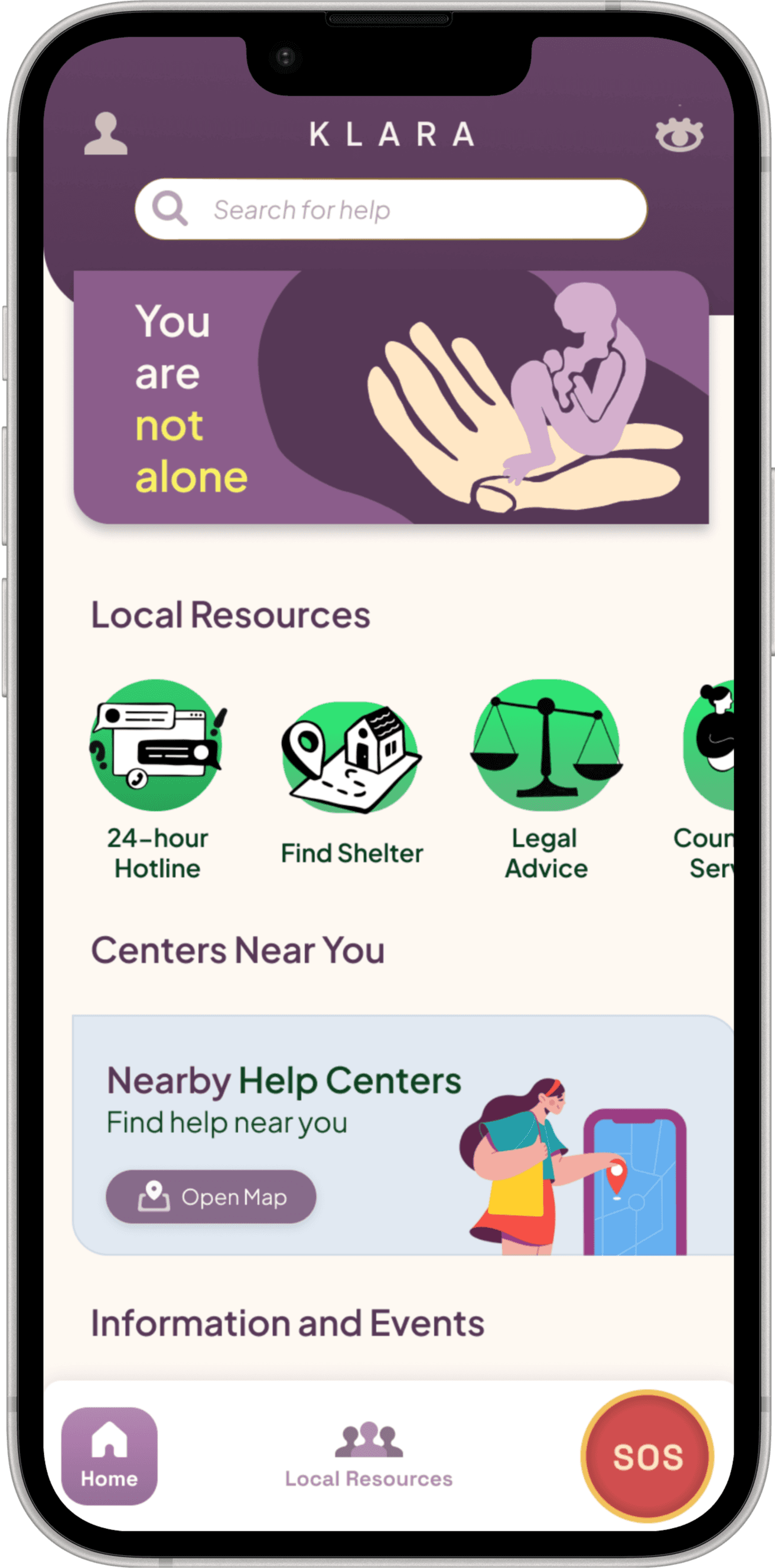
Vienna has a strong domestic violence support network but it is scattered across dozens of organisations and phone numbers. For someone in crisis, often watched by a partner with seconds to act, that scattering is the real barrier.

Official numbers only reflect cases reported to authorities. The true scale of abuse is far larger than statistics show.
support organisations across Vienna no shared entry point
existing apps combine discretion with a local directory
partner monitoring a phone is enough to make any of this unsafe

Research
Listening before designing.
Research combined a persona narrative, two rounds of competitor benchmarking, interviews, and affinity mapping with 5 participants.
Klara's name comes from a persona built during research, a woman who endured abuse for fifteen years and was told no one would help her. He was wrong. Klara is your sister, your mother, your friend, your colleague.

Address violence inside the household?
Raise awareness of support centres?
Help people recognise abuse?
Safe location sharing when feeling unsafe?
Branding
A name that reads as a person.
Colour was chosen to calm, not alarm. Soft, warm neutrals carry the everyday interface, while red is reserved exclusively for SOS and emergency actions. That restraint matters — when one colour means danger and nothing else does, it can be trusted instantly, even under stress.
D9D9D9
D9D9D9
D9D9D9
D9D9D9
D9D9D9
0F582B
E3B7B8
DD8182
D04E4F
Information Architecture
Organised by urgency.
The first IA grouped services by institutional topic. It tested poorly, someone in crisis thinks in questions not categories. Where can I go right now? Who can I call?
Agreement on Core Nav
Placed SOS in primary
I need help right now
Nearby help centres
Safe place to stay
I have special needs
Family support
The Build
Designed to be used without thinking.
Every core safety feature was designed against one constraint: it has to work when the person using it is frightened, rushed, and possibly being watched.


Hiding Mode
One tap and the interface transforms into a bland weather app. Local forecasts, hourly data, and zero trace of safety features.

Safe Mode
Forced to open the app? A separate PIN shows fake content while silently alerting trusted contacts.

Testing
Moderated sessions 60 to 75 minutes with 5 to 8 participants of varied ages, older adults deliberately included.
Onboarding
Account creation and safety target under 15 min
Emergency
SOS activation timed target under 2 min
Control
SOS deactivation must be easily findable
Directory
Help centre navigation target 10 to 15 min
FIX IMMEDIATELY
• SOS button prominence
• Hiding mode instructions
HIGH PRIORITY
• Shelter location info
• IA deduplication
• SOS countdown timer
MEDIUM PRIORITY
• Tutorial tutorials
• Visual feedback
• PIN clarity
Learnings
1. Categorisation struggles
Institutional IA tested poorly. landed on urgency-based grouping.
2. Older users insecurity
A trust gap not a usability one, onboarding simplified.
3. Tooling Friction
Procreate export issues required move to AirDrop and cloud transfer.
4. Stress testing gap
Testing with mental health professionals is needed to close the realism gap.
"Every project I work on now carries this awareness: design isn't just about making things look good or work well. For some users it's about making things safe."