
Duolingo removed the community. The Lightbulb brings it back.
Duolingo tells you the rule. Not how a real person would say it, or where. The Lightbulb fills that gap, human explanations, by country.

ROLE
UX/UI Designer
What I did
User interviews, Reddit research, competitive analysis across Babbel, Busuu, and Memrise, 4 personas, RICE scoring across 16 features, usability tests with 3 users.
Where it's at
Concept: Designlab bootcamp
01 - The Problem
Duolingo explains the answer. Not what it means.
Duolingo added AI explanations for wrong answers. But those explanations have no cultural context and no expert review. You learn your sentence was grammatically wrong, not whether it would sound rude, or only work in one region.
The forums where people used to figure this out together? Gone since 2023.
1
explanation type, AI-generated, no cultural context
0
community features since the 2023 forum removal
4
personas, one shared frustration
"Language is the road map of a culture."
Rita Mae Brown

02 - WHERE IT STARTED
The first idea wasn't this feature.
I started designing "Explain My Answer", a button that would break down why you got something wrong. These are the early sketches, before I knew it already existed.
Then I tested Duolingo Max, the $30/month tier, to check my idea against the real app. Same feature. Already built, just not for free users.
That was my first mistake: designing something that already existed.
03 - RESEARCH: INTERVIEWS
What kept coming up.
I talked to people who use language apps, and read through Reddit threads where thousands of learners compare notes.
The same problem surfaced again and again: Duolingo removed its forums. That's where people used to share tips and help each other. Users still miss it.


04 - Research: Competitive Analysis
Three apps teach culture. None of them explain your mistakes.
I looked at Mango, Busuu, and Memrise, the three apps that lean hardest into cultural learning.
Mango teaches culture upfront, like a structured course. Busuu connects you with native speakers. Memrise shows you real people, real places.
Three different approaches. Same blind spot: none of them tell you why your answer was wrong.

05 - RESEARCH SYNTHESIS
The research pointed somewhere the AI couldn't follow.
Users have spent 1,500+ days on Duolingo and still can't hold a real conversation. They know the words. Not when to use them.
A cultural note fixes a sentence. Real context fixes how you show up in another language.

"Three questions shaped everything after this: The Context Gap. The Trust Crisis. The Quick Session Paradox."
06 - persona
They know the words. Not when to use them.
Four types of learner came out of the research, each stuck in a different way. Sofia, the Practical Learner, became the primary persona. She doesn't just want to know the rule. She wants to know when to use it.
If a feature didn't help Sofia use what she's learning, it didn't ship.


07 - INFORMATION ARCHITECTURE
One screen, one moment: right after you answer.
The app follows one loop: answer a question, get it right or wrong, and choose whether to go deeper.
I explored two other paths early on, reviewing mistakes, browsing the guidebook. Learn Why is the one that survived every pivot, because it's the moment the frustration actually happens.
08 - WIREFRAMES & ITERATION
Right icon. Just needed a second look.
I sketched Learn Why first, no color, no styling, just the flow.
Testing showed 2 out of 3 users didn't recognize the lightbulb icon right away. One suggested it should look like the Duolingo owl, until they realized the owl was already used for something else in the app.
The icon was right. It just needed a first-time explanation.

09 - THE SOLUTION
One tap, and the answer makes sense.
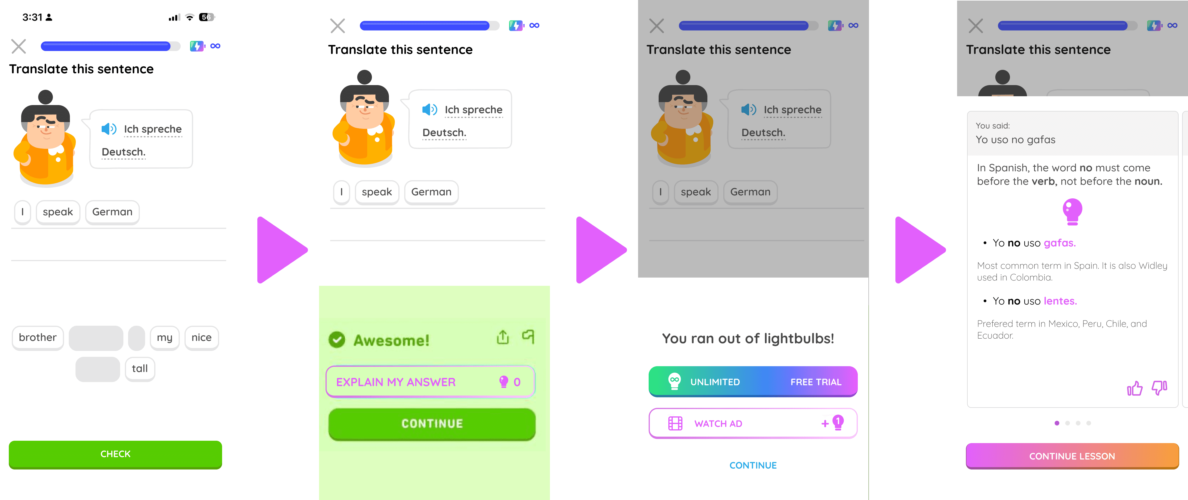
When you get something wrong, you can tap to see why, not just that you're wrong, but the cultural reason behind it. Reviewed by a human, not just generated by AI.
Free users get a limited number of explanations, refilled over time or unlocked by watching an ad. That's what makes it possible to pay real experts to review every answer, without charging users for it.

10 - THE ECONOMICS
A feature that pays for itself.
Duolingo has 300M users, more than Busuu, Memrise, and Mango combined. That scale is what makes this work.
Free users unlock explanations by watching ads. That revenue pays real experts to review every answer, a cost the old model never solved.


11 - TESTING & REVISIONS
Everyone finished. But two things needed fixing first.
I tested the flow with real users, thinking out loud. Everyone completed every task, but a few small things caused real confusion.
Here's what changed, and why:


12 - ROADMAP
Everything else can wait.
I scored 16 features by reach, impact, confidence, and effort. Three made the cut: a quick lesson tip, expandable story notes, and a formality cue. The rest wait for later.

13 - RESULT + LEARNINGS
Every pivot got me closer to the real issue.
This went through three versions. The first already existed inside Duolingo Max. The second got made obsolete when Duolingo made AI explanations free for everyone, a month into the project. Each pivot pushed past the feature and into the real problem: not the explanation itself, but who reviews it, and how that stays sustainable.


